
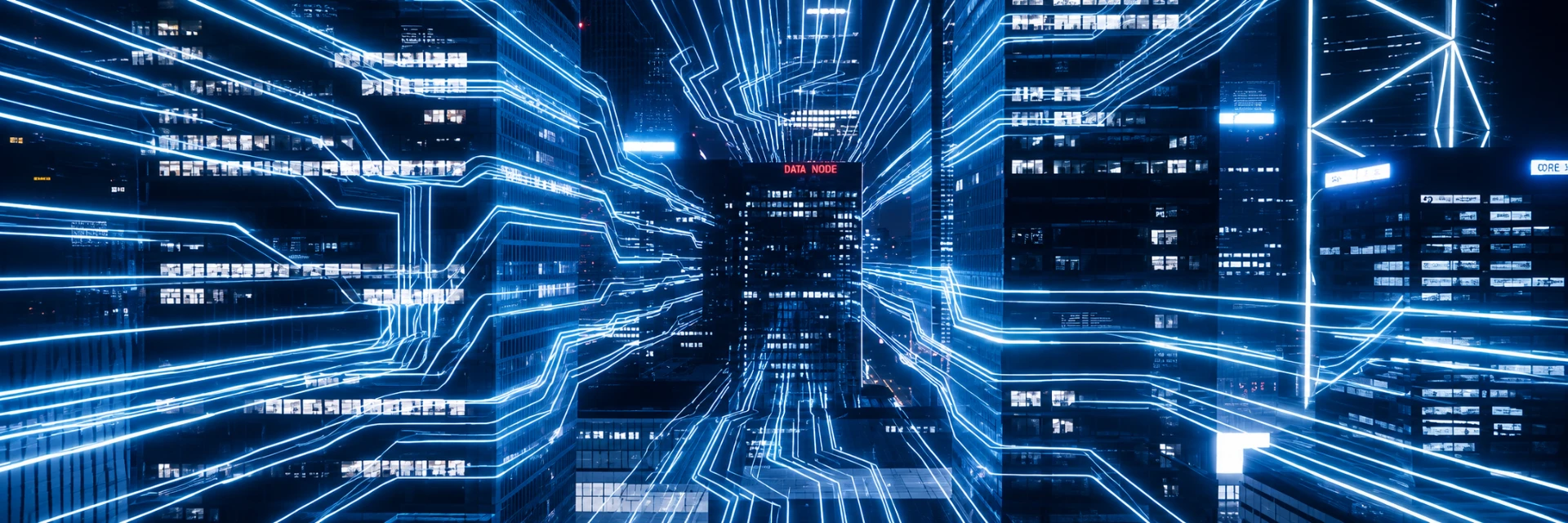
Electricity is the
lifeblood of the
digital age.
We are building Australia's largest network of regional energy hubs.
INTREC Energy develops regional high‑voltage, energy dense platforms for Battery Energy Storage Systems, Data Centres and Ultra Fast Transport Charging.
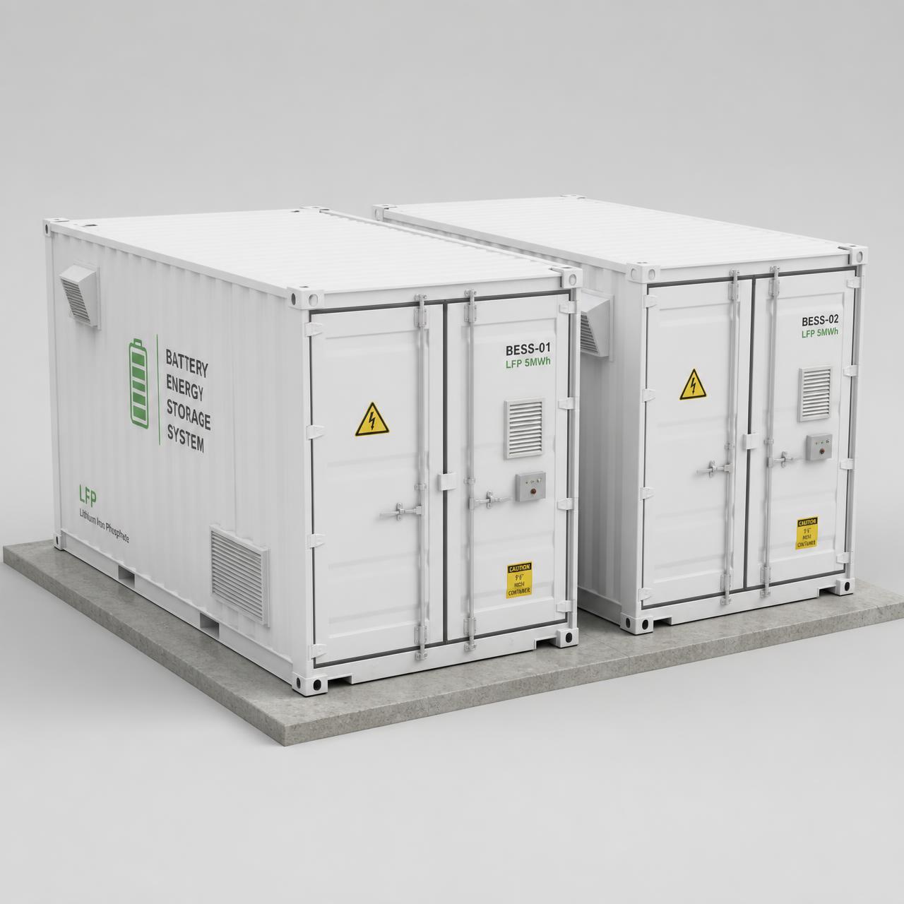
Battery Energy Storage
Grid-forming LFP batteries trading NEM volatility as coal exits.
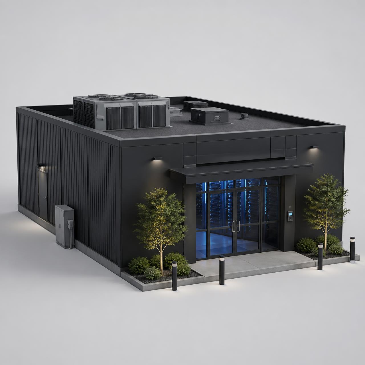
Data Centres
Battery-backed capacity for edge and AI workloads without grid augmentation charges.
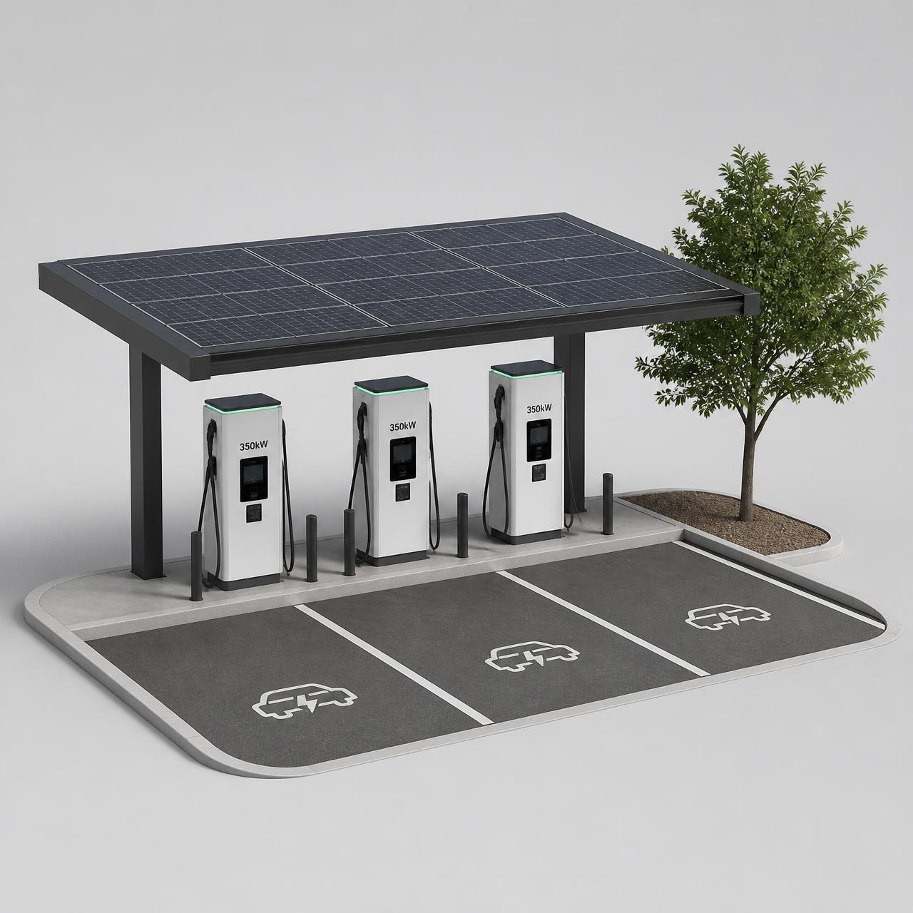
Ultra Fast Charging
350kW+ energised charging on freight corridors — no five-year connection queue.
NEM Merchant
Energy arbitrage, FCAS and grid services from grid-forming LFP batteries.
EV Charging Lease
Reserved capacity leased to charge-point operators plus energy throughput margins as utilisation ramps.
Compute-as-a-service
AI inference and HPC workloads where grid-constrained operators can't build.

100MW dispatchable
by month 36.
Built in waves across four NEM regions. Foundation portfolio secured in NSW and SA.